My2Cloud gives you two ways to look at your services: Live dashboards that show what is happening right now and keep refreshing on their own, and Usage (analytics) dashboards that show how things have changed over a date range you choose, with up to twelve months of history. This guide explains the difference and when to reach for each.
Where to find them. Live dashboards sit under the Services menu (for exampleBackup2Cloud › Dashboard). Usage dashboards sit under the Analytics Data menu (for exampleBackup2Cloud › Dashboard). Your own My Dashboard can mix widgets from both.
The short version
- Live dashboards answer "what is the position right now?" - current accounts, protected machines, consumption and status. They update themselves in the background, and they do not have a date-range filter.
- Usage (analytics) dashboards answer "how has this changed over time?" - trends, growth and month-on-month movement. They have a date-range filter so you can choose the period, up to twelve months.
Live service dashboards
Each service brand has its own live dashboard: Backup2Cloud, DR2Cloud, SaaS2Cloud and Veeam2Cloud. These show the latest known figures - the numbers you would quote if someone asked "how many accounts do we have today?" or "is everything protected right now?"
Live widgets refresh automatically while the page is open, so you do not need to reload. Most live figures update roughly every few minutes. DR2Cloud (Zerto) refreshes more often because replication status changes quickly, and its live recovery-point (RPO) chart updates almost continuously as it accumulates in real time.
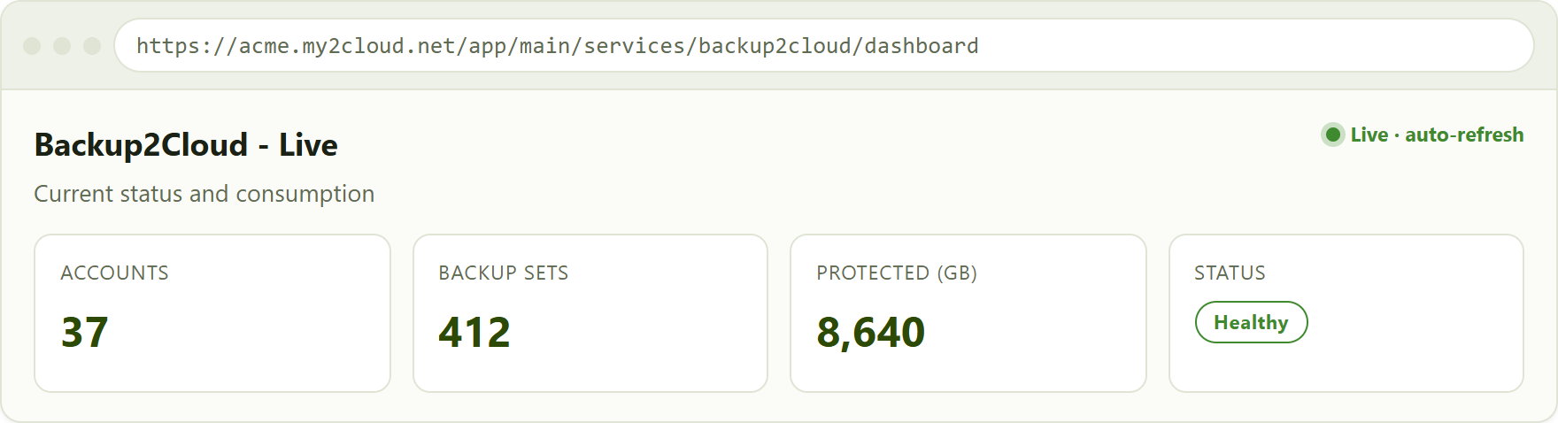
a live service dashboard shows the current position and updates on its own. There is no date-range filter.
No date range on live. Because a live dashboard always shows "now", it has no date picker. If you want to look back over a period, use the matching usage dashboard instead.
Usage (analytics) dashboards
Every service also has a usage dashboard under Analytics Data. Instead of a single current figure, these draw on My2Cloud's stored history - snapshots collected regularly and kept for up to twelve months - to show trends and growth over the period you pick.
The key difference in the header is the date-range filter. Choose a start and end date (or use one of the quick presets) and every chart, table and trend tile on the page redraws for that window. Usage dashboards do not auto-refresh in the same continuous way as live widgets; they reflect the collected history for the range you selected.
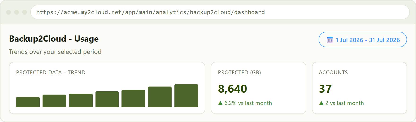
a usage dashboard adds a date-range filter and shows trends and month-on-month change rather than a single current number.
Live vs Usage at a glance
| Live dashboards | Usage (analytics) dashboards | |
|---|---|---|
| Shows | The current position, right now | History and trends over a period |
| Time span | Latest known values | Any range, up to twelve months |
| Refresh | Automatic, every few minutes (DR2Cloud more often) | Reflects collected history for your chosen range |
| Date-range filter | No | Yes |
| Best for | Daily status checks, "is everything OK now?" | Reporting, growth, capacity planning |
| Found under | Services menu | Analytics Data menu |
Which one should I use?
- "Is everything protected and healthy today?" - open the live dashboard for the service and let it refresh.
- "How much has our backup grown this quarter?" - open the usage dashboard and set the date range.
- "I need figures for a report or review." - use the usage dashboard, pick the period, and export if you need to.
- "I want current status and a trend on one screen." - build your own My Dashboard mixing Live and Analytics widgets.
Tip: mix both on My Dashboard. When you customise a dashboard, widgets are named as Service - Type - Metric, where the type is either Live or Analytics - for example "Backup2Cloud Live - Accounts" alongside "Backup2Cloud Analytics - Backup Sets". Live widgets keep the current number in view while Analytics widgets show the trend. See Customising your dashboard.
Related articles
- Setting a dashboard's date range - how the date filter works on usage dashboards and detail views.
- Customising your dashboard - adding, moving and mixing Live and Analytics widgets on your own dashboard.
Tips
- If a usage dashboard looks empty, widen the date range - there may be no history in the period you picked, or the service was added more recently.
- A live figure and a usage figure for "today" can differ slightly: live shows the most recent reading, while usage is built from regularly collected snapshots.
- You do not need to refresh the browser on a live dashboard - leaving the page open keeps the numbers current.
Was this article helpful?
That’s Great!
Thank you for your feedback
Sorry! We couldn't be helpful
Thank you for your feedback
Feedback sent
We appreciate your effort and will try to fix the article