My2Cloud gathers usage figures from each of your protected services on a regular schedule and keeps up to twelve months of history. This guide explains where those numbers come from, how often they update, and why a live view can differ from the historical charts.
In short. The analytics and dashboard figures are collected roughly every hour and stored, so they build a rolling history you can look back over. The Live views instead fetch the current position from each service the moment you open them. Both are correct - they are simply taken at different times and in different ways.
Where your data comes from
My2Cloud brings together four Assurestor cloud data-protection services under one portal. Each one maps to a service brand you may already know:
- Backup2Cloud - your Asigra backup accounts, backup sets and stored capacity.
- DR2Cloud - your Zerto disaster-recovery protection groups, virtual machines and licences.
- SaaS2Cloud - your CloudAlly protection of Microsoft 365, Google Workspace and similar SaaS data.
- Veeam2Cloud - your Veeam-protected workloads and organisations.
You only ever see the services and accounts that belong to your organisation. If a service is not part of your plan, its figures simply will not appear.
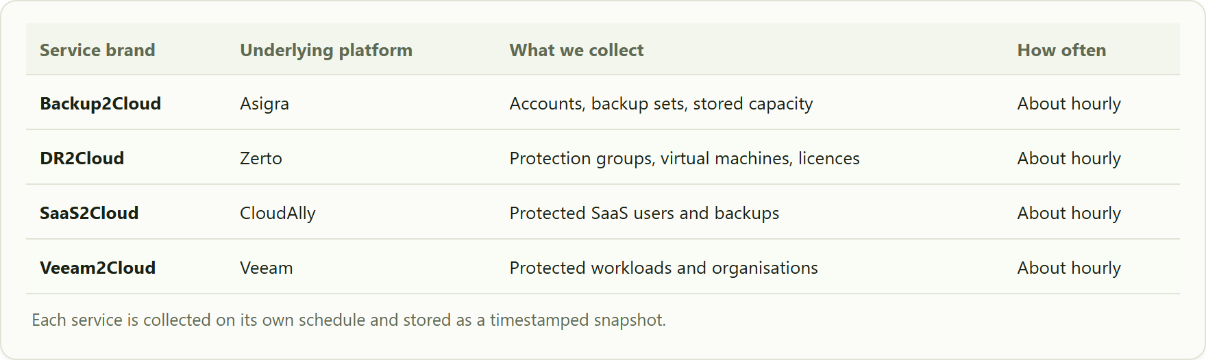
how each service brand maps to a platform, what My2Cloud reads from it, and roughly how often.
How often the figures refresh
Behind the scenes, My2Cloud checks in with each service on a rolling schedule - in practice about once an hour per service. Every check takes a fresh snapshot of your usage and files it alongside the previous ones, which is what builds your history over time.
Because each service is collected separately, they will not all update at exactly the same minute. That is normal. What matters is that, over the course of an hour, every service is refreshed.
Twelve months of history
My2Cloud keeps roughly the last twelve months of these snapshots. That is what powers the trend charts, month-on-month comparisons and the usage figures across the Analytics and Dashboard areas. Snapshots older than the retention window are tidied away automatically, so the portal always reflects a rolling year rather than growing indefinitely.
The "Last Data Collection" indicator
So you can always see how current the stored figures are, the portal shows a Last Data Collection panel. Each service has its own tile telling you how many minutes ago it was last collected, together with a health label. The panel header also shows when the reading itself was last refreshed.
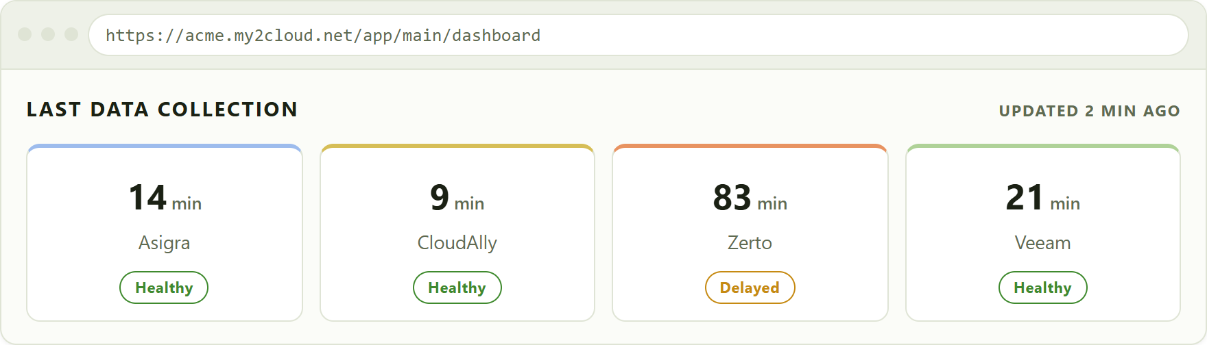
the Last Data Collection panel. Each tile shows how long ago that service was collected and its current health.
The health labels mean:
- Healthy - the service was collected recently and successfully.
- Delayed - the last collection was later than expected, so the figures may be a little behind.
- Failed - the most recent attempt did not complete. The stored figures are the last good ones until the next successful run.
- Unknown - no recent collection has been recorded yet for that service.
Selecting a tile shows the last few collection runs for that service, each with its time and outcome, so you can see at a glance whether a service has been keeping up.
Live views versus historical figures
Some parts of the portal are marked as Live. These do not use the stored snapshots at all - they reach out to the service and fetch the current position the moment you open the page. That makes them ideal for checking exactly what is happening right now.
The Analytics charts and most dashboard figures work the other way round: they read from the stored history, which was last refreshed at the time shown by the Last Data Collection indicator.
Why a live view and a chart can disagree. If you open a Live view a few minutes after something changed, it will show the new position immediately, while the historical charts will not catch up until the next scheduled collection. This is expected - the two are gathered at different moments and in different ways. Give it up to about an hour and the history will line up.
If collection stalls
My2Cloud keeps an eye on its own collection. If a service stops reporting for longer than expected, its tile changes from Healthy to Delayed or Failed, and the situation is flagged so it can be looked into. Your existing figures are never lost - the portal simply keeps showing the last good snapshot until collection resumes, at which point the tiles return to Healthy on their own.
Tips
- Check the timestamp first. If a figure looks out of date, glance at the Last Data Collection panel to see when that service last updated.
- Use Live for "right now". When you need the current position rather than a trend, open the Live view for that service.
- Give it an hour. A brand-new change may take until the next collection to appear in the historical charts.
- A Delayed or Failed tile that clears itself is normal. Occasional blips happen; if a service stays Failed for a long time, raise a ticket and mention which service is affected.
Was this article helpful?
That’s Great!
Thank you for your feedback
Sorry! We couldn't be helpful
Thank you for your feedback
Feedback sent
We appreciate your effort and will try to fix the article